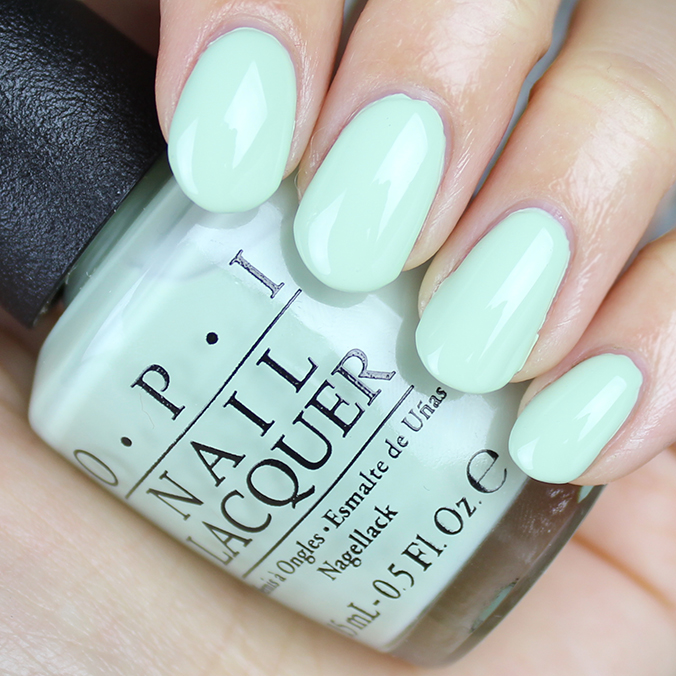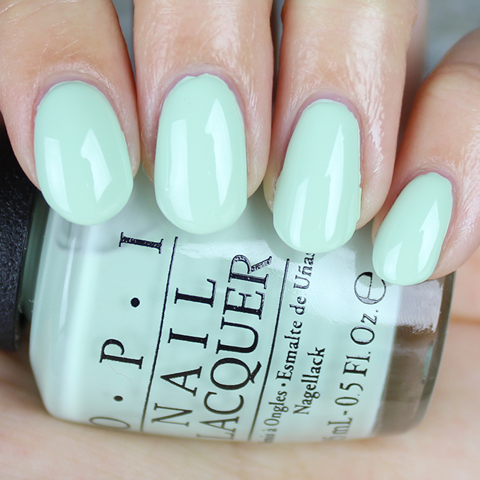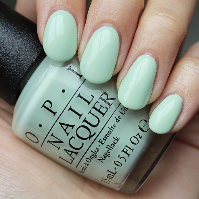
Enjoy a refreshing manicure that’s as cool as a cucumber with OPI This Cost Me a Mint from the SoftShades 2016 Collection!
(Yup – according to OPI, it’s officially called ‘SoftShades’ and not ‘Soft Shades’, even though I’ve been seeing both one-word and two-word versions all over the internet.)
Being a green nail-polish lover, you know that I had to dip into OPI This Cost Me a Mint right off the bat!
Spring, mint ice cream, and mojitos are stamped all over this baby.
Oh, and in case you’re wondering how it compares to OPI That’s Hula-rious! (from the Hawaii Collection), scroll further down this post for my comparison swatches.
OPI This Cost Me a Mint Pictures

Artificial Light

Natural Light

Artificial Light

Natural Light

Swatches
All swatches have:
- OPI Nail Envy Nail Strengthener – Original version (Used as a base coat)
- 3 coats of OPI This Cost Me a Mint
- Seche Vite Dry Fast Top Coat
Artificial Light Photos


Natural Light Photos


Claim: TRUSTED
- Cool, refreshing pale green (Yes)
Key Notes
- Name: OPI This Cost Me a Mint
- Collection: OPI SoftShades 2016 Collection
- Press Release: Click here to see the official OPI SoftShades 2016 Collection press release!
- Quick Look: Click here to see OPI SoftShades 2016 Collection swatches & bottle shots!
- Colours Available in the Collection: This Cost Me a Mint, It’s in the Clouds, One Chic Chick, Stop It I’m Blushing!, It’s a Boy! & I Am What I Amethyst
- Amount: 15 mL (0.5 fl. oz.)
- Retail Price: $12.50 CAD
- Disclosure: This post contains a press sample provided by PR.
- Where to Buy: Trade Secrets, professional salons, Chatters, Dillard’s, Regis & ULTA stores & ULTA website (Note: Available soon at Nail Polish Canada, Hudson’s Bay & BeautyBrands.com)
OPI This Cost Me a Mint Review
Colour
This Cost Me a Mint by OPI is a white-based mint green that balances between being a pale pastel and being saturated enough so that it leans more on the green side.
I can see how, on certain skin tones, it has the potential to pull the red from your skin tone, however, that didn’t seem to be the case with me.
Finish
A creme like this is versatile because it can be worn alone for a simple look or used in a variety of nail-art designs.
Since it has a creme finish, it’s very easy to remove without much effort.
Application & Formula
A lot of light shades tend to have a fussier formula. (At least, that’s the case from many that I have worn in the past.)
The first coat is streaky, but it builds up opacity quickly by the second coat. I found that I required three coats to completely cover my nails without any bald patches. This is pretty typical of white-based nail polishes, in my experience. (Of course, there are exceptions, but most of the ones I’ve tried fall in this category.)
The formula itself is easy enough to work with – nothing too thick or too watery. Just make sure that you wait a little bit in between coats to get better coverage and to avoid unnecessary streaking.
OPI That’s Hula-rious! vs. OPI This Cost Me a Mint
You may remember OPI That’s Hula-rious!, which was from the Hawaii Collection. It’s very similar in colour and finish to OPI This Cost Me a Mint.
When you look at the side-by-side comparison swatches, you’ll see that OPI That’s Hula-rious! appears a hair brighter. However, I think you can get away with owning just one instead of both because they’re extremely close.
Even though I like bright colours, if I had to choose between the two, I would go for OPI This Cost Me a Mint because the formula also seemed to be a bit better.
You may also notice that the nail-wheel swatches are a bit different than what it looks like when I wear the nail polishes. I suppose that’s because my skin tone plays a factor in how my camera interprets the nail-polish colour.
On me, it seems to morph with a touch of blue in the green, compared to what it looks like on the nail wheel. (I did, however, use the same number of coats on the nail wheel as I did when I wore the polish as a full manicure: 3 coats.)

Artificial Light

Natural Light
Also, check out this older post to see comparison swatches of OPI That’s Hula-rious! and other greens.
Ingredients
This Cost Me a Mint by OPI is free of Formaldehyde, Toluene, and DBP, which you may appreciate if you’re allergic to those ingredients, or if you’re making conscious shopping decisions.
Pros
|
Cons
|
Final Verdict: 7.5/10
I love the way a good minty green looks on shorter nails, and as much as I’m a green fiend, I find myself admiring white-based greens on other people way more than on myself. Maybe it’s because I prefer saturated colours.
Do you prefer OPI This Cost Me a Mint or OPI That’s Hula-rious!? Are you a fan of white-based pastels, or do you crave saturated tones more?


Such a pretty color and perfect for spring. This one’s calling my name, but I’ll have to pass on this one. I have That’s Hula-rious which makes me happy. Thanks for sharing it with us. It looks great on you!
Hey Melissa!
Yeah, if you already have OPI That’s Hula-rious!, there’s no need to get this. They’re so close!
I like that green too, I can see awesome pedis with that! Also most of my mints lean blue, I need a green mint!
Hey Tanya!
This one would really pop against your skin tone. It’s such a refreshing minty green. Hope you like it, if you decide to give it a spin!
I don’t own That’s Hula-rious but it was definitely my go-to polish at the nail salon. I’ve been thinking about it a lot and was going to eventually pick it up but I picked up This Cost Me A Mint yesterday and wondered how it compared 🙂 I also picked up by China Glaze and Mint Sorbet by Sally Hansen and swatched them all. You’d be interested to know that they all looked identical on the nail, but that’s in shining the flashlight on my phone as my living room was still pretty dark with all the lights on. I’ve half a mind to do my nails with all of them and see if anyone can spot the difference.
Sorry I meant Refresh-mint by China Glaze.
Hey Jordan!
So interesting to hear that the China Glaze and Sally Hansen looked similar to you as the two OPIs! If you do decide to swatch them again and look at them in natural light, yes, please do stop by and let me know your thoughts. I’d be curious!