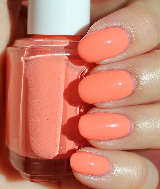
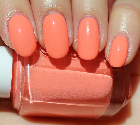
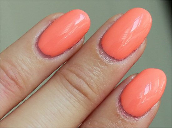
 Essie Haute as Hello comes from the Summer 2010 Collection, and it’s a light coral with orange undertones.
Years ago, I would never have given it the time of day. I’d brush past it like a polish snob with my nose in the air.
These days, I’ve learned to branch out and try new colours.
Of course sometimes I’m left disappointed, but other times (like with this polish), I’m pleasantly surprised. And it’s fun to discover new shades to play around with.
Essie Haute as Hello Pictures

Sunlight

Natural Light

Flash

Sunlight

Natural Light

Flash

Essie Haute as Hello Ingredients


Essie Haute as Hello Swatches
All swatches have:
- Seche Clear Crystal Clear Base Coat
- 3 coats of Essie Haute as Hello
- Seche Vite Dry Fast Top Coat
Sunlight Photos


Natural Light Photos


Flash Photos


Claim: TRUSTED
√ Coral
Key Notes
- Name: Essie Haute as Hello
- Collection: Essie Summer 2010 Collection
- Colours Available in the Essie Summer 2010 Collection: Haute as Hello, Pretty Edgy, Knockout Pout, Vermillionaire, Demure Vixen & Miss Matched
- Amount: 15 mL (0.5 fl. oz.)
- What I Paid: Nothing! (This was provided by Natali Products. Retails for $8 USD.)
- Where to Buy: Natali Products (if you’re an industry professional), Head2Toe & perhaps some Trade Secrets that sell old colours
Essie Haute as Hello Review
Colour
This is a very bright and light coral with orange leanings. While it isn’t a neon, it certainly stands out. It’s maybe two notches away from being a neon.
In sunlight, it’s a little like cantaloupe, but in dim light, the orange deepens a touch.
Haute as Hello by Essie is the kind of colour that reminds me of the warm weather because I rarely crave it in the fall or winter. I conjure up mental images of peach bellinis – yum!
Finish
I love how this is a simple creme polish. It’s light, fresh, and clean. Very easy to remove.
Application & Formula
The formula on this was pigmented, but with two coats, I thought I saw a streaky patch on one nail, so I just did a third coat on all my nails to ensure better coverage.
The first coat is very streaky. The second is significantly better. And the third evens everything out.
In dim artificial lighting, I could see very slight visible nail line in certain angles, but overall, I think this polish did a great job at covering the nail.
Pros
|
Cons
|
Final Verdict: 8/10
I enjoyed wearing Haute as Hello by Essie very much. It’s clean, fresh, and summery! 🙂
This shade is perfect if you’re curious about trying an orange polish, but want something that isn’t too extreme and is still traditionally feminine.
Do you prefer orange- or pink-based corals? Did you try any of the other colours from the Essie 2010 Collection? Are there any polishes from older collections that you wish would be resurrected?


Clean, fresh, and summery is so right!! I love this on you. This would definitely get lots of attention.
MariJo recently posted: Twinsie Tuesday – Ombre Manicure
Hey MariJo!
And it’s so pretty in the bottle, too. It’s the kind of colour that brings a smile to your face – perfect!
I really wanted to like this polish but it looked absolutely horrid on my darker skin. It actually looks very nice on you! I love the creaminess of this color.
Cynthia recently posted: Deborah Lippmann Let’s Hear It For The Boy
Hey Cynthia!
Oh yeah? I would’ve thought that a richer skin tone would make this colour pop even more. Hmm…interesting.
This is a polish that would scream my name the loudest if/when I pass it at the store 😉
Shades like this make me happy.
A few years back I would prefer my corals/polish to lean more pink, now I like a bit of the orange peeking through (it seems more mature?)
would you know how this compares to CG Peachy Keen?
Marta recently posted: It’s not White!
Hey Marta!
When polishes scream at us like this, how are we expected to ignore them? 😉
I think you rock corals better than most people, actually! You manage to make colours like this look very clean and sophisticated yet fun at the same time.
After pulling out my bottle of China Glaze Peachy Keen to compare, it looks like Peachy Keen is closer to cantaloupe orange and doesn’t have any coral-pink. Haute as Hello has a few drops of pink/red-coral in comparison. But when you put a pink coral next to Haute as Hello, Haute as Hello looks more orange. Also, they seem to be around the same in terms of saturation.
Holy cannoli, this is gorgeous on you! It’ll look horrible on me, though. I’m fairly sure of it. But wow, such a pretty shade. I’d probably pass on this only because I know it just won’t work with my skintone. Which is mostly why I prefer my corals to lean more pink although the orange-y ones are always something I’ll covet.
Carmela recently posted: Hammie visits Joanne at Northern Nails with (More) Beach-y Nail Art
Hey Carmela!
Are you sure it’d look horrible on you? Have you tried a lot of peachy shades? Maybe you just need to find a shade that’s darker or lighter? (I’m not sure what the ‘rules’ are because I’ve generally just had good luck haphazardly picking oranges!)
I have Barielle Blossom which looks like a pinkier version of this and even that looks terrible on me! But I guess you can never really tell till you try it..?
Carmela recently posted: Nail Art Wednesday: Gold Swirls on Purple
Yeah, sometimes colours you think would look horrible wind up being so pretty.
This look gorgeous on you!!!
I like any coral… as long as it is not too orange…
wow! so pretty!
Marta recently posted: NEW MASH PLATES- A Review
Hey Marta!
Thanks! I can see this looking fab on your digits. Great chipper shade that’s one of those mood-boosting polishes.